Develop iOS, Android and Windows applications using HTML – Part 1
Prerequisites: Basic knowledge of HTML , CSS and jQuery Mobile
This is the part one of the series, You can directly to second part from Develop iOS, Android and Windows applications using HTML – Part 2
There are different ways to develop mobile applications. One is to develop the applications using the Native Software Development Tools ( like developing Android applications using Eclipse in JAVA, or developing iOS application using XCode in Objective C) and the other one is to develop cross platform (i.e. platform independent applications, iOS, Android, Windows, BBM) applications using Hybrid Development Tools in HTML5 and CSS. To know about the difference between Native and Hybrid application development, please refer here . This tutorial will be a part of the series and some more tutorials will follow after this post.
Step 1
Donwload a Text Editor to write HTML code. Proffered ones are Notepad++ and Sublime Text. I am using a great Text Editor called Sublime Text 2 which you can download here.
Step 2
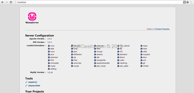
Download Wamp Server from here. After installation, run it and go to localhost. You will see an image as shown below.
Step 3
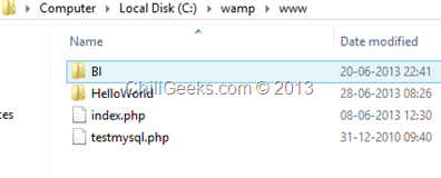
Go to the wamp server installation directory and create a folder named “HelloWorld” in www . (path: C:wampwww)
Download jQueryMobile reference files from here to Include the jQuery Mobile Scripts into your html page . Download Minified: jquery.mobile-1.3.1.min.js and Minified with Default theme: jquery.mobile-1.3.1.min.css (Right Click and Save As).
After this, Download jQuery scripts from here. Download the compressed, production jQuery 1.10.1 and create a new folder in “HelloWorld” by the name of “jquery-mobile” .
Step 4
Go to “HelloWorld” folder and create a new .html file using using sublime text.
Reference the scripts downloaded in Step 3 and create the basic HTML Structure as shown below :
1: <!DOCTYPE>
2: <html>
3: <head>
4: <meta charset="UTF-8" />
5: <meta name="viewport" content="user-scalable=no, width=device-width, initial-scale=1, maximum-scale=1">
6: <title>ChillGeeks</title>
7: <link href="jquery-mobile/jquery.mobile-1.3.0.min.css" rel="stylesheet" type="text/css" />
8: <script src="jquery-mobile/jquery-1.8.2.min.js" type="text/javascript"></script>
9: <script src="jquery-mobile/jquery.mobile-1.3.0.min.js" type="text/javascript"></script>
10: </head>
11:
12: <body>
13:
14: </body>
15: </html>
This is the basic page without any content. Now go to https://view.jquerymobile.com/1.3.1/dist/demos/ and click on Header Toolbar. View the source of any header you like to insert. I am in love with blue color so I am using that.
Insert the below code in thetag :
1: <div data-role="header" data-theme="b">
2: <h1>Chill Geeks</h1>
3: </div>
After this your code looks like this :
1: <!DOCTYPE>
2: <html>
3: <head>
4: <meta charset="UTF-8" />
5: <meta name="viewport" content="user-scalable=no, width=device-width, initial-scale=1, maximum-scale=1">
6: <title>ChillGeeks</title>
7: <link href="jquery-mobile/jquery.mobile-1.3.0.min.css" rel="stylesheet" type="text/css" />
8: <script src="jquery-mobile/jquery-1.8.2.min.js" type="text/javascript"></script>
9: <script src="jquery-mobile/jquery.mobile-1.3.0.min.js" type="text/javascript"></script>
10: </head>
11:
12: <body>
13: <div data-role="header" data-theme="b">
14: <h1>Chill Geeks</h1>
15: </div>
16: </body>
17: </html>
Save it and run https://localhost/helloworld/ on your Chrome. It should look like this :
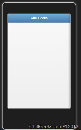
This won’t give you the feel of how it would look on Mobile. To do this, download the mobile simulator ripple from here and add it to Chrome. Enable it and your app will look like this :
You can put any type of the element using jQueryMobile demo website. Just visit here .
After this initial header, let us just add some form elements. We will be adding textboxes and buttons.
Now after the closing div tag of the header, just add the following code :
<div data-role="content">
<h3>
This demo will show you how to add form elements
</h3>
</br>
<input type="text" name="text" id="name" value="" placeholder="Enter Your Name">
<input type="tel" name="text" id="phone" value="" placeholder="Enter Your Phone Number">
<input type="text" name="text" id="address" value="" placeholder="Enter Your Address">
</div>
The data-role element in the above code defines the role of the content and then map its designing as based on the jQueryMobile scripts. After this , let’s add a submit button.
</br>
<div style="text-align:center">
<a href="#" data-role="button" data-inline="true" data-theme="b" >Submit</a>
</div>
After this, your complete code looks like this :
<!DOCTYPE>
<html>
<head>
<meta charset="UTF-8" />
<meta name="viewport" content="user-scalable=no, width=device-width, initial-scale=1, maximum-scale=1">
<title>ChillGeeks</title>
<link href="jquery-mobile/jquery.mobile-1.3.0.min.css" rel="stylesheet" type="text/css" />
<script src="jquery-mobile/jquery-1.8.2.min.js" type="text/javascript"></script>
<script src="jquery-mobile/jquery.mobile-1.3.0.min.js" type="text/javascript"></script>
</head>
<body>
<div data-role="header" data-theme="b">
<h1>Chill Geeks</h1>
</div>
<div data-role="content">
<h3>
This demo will show you how to add form elements
</h3>
</br>
<input type="text" name="text" id="name" value="" placeholder="Enter Your Name">
<input type="tel" name="text" id="phone" value="" placeholder="Enter Your Phone Number">
<input type="text" name="text" id="address" value="" placeholder="Enter Your Address">
</div>
</br>
<div style="text-align:center">
<a href="#" data-role="button" data-inline="true" data-theme="b" >Submit</a>
</div>
</body>
</html>
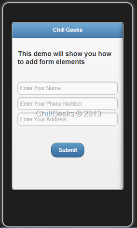
Save the document and run https://localhost/helloworld/ on your Chrome. It should look like this :
This is the basic application, and does nothing but helps you to understand how to create mobile application. This currently runs on your browser, however, in the next tutorial, I’ll show you how to run this on your mobile.
Build out your mobile application tech stack with these mobile app tools, which include native app and open source tools.


